
Chasing the Timberdoodle

The COS letterhead, recreated by Kelly Ballantyne.
words by Robyn Detterline and Lindsay Wilkes
The archives of the Chicago Ornithological Society (COS) are kept at the Chicago Academy of Sciences collections, which are housed in a nondescript brick cube building in the Ravenswood neighborhood. Filed in the collection, contained in eight boxes and numerous manilla envelopes, are the pre-digital-age documents kept by COS, founded in 1912 to “study the science of ornithology, particularly in the Chicago area.” The oldest document is likely a Jackson Park checklist from April 20, 1926, completed by Amy Baldwin, a prolific birder who contributed 516 lists to COS. Other early twentieth century material include announcements, correspondences, and meeting minutes.
As these early documents were handwritten or typewritten, they have no design. One exception is the COS letterhead, which was in use at least as early as 1962, but which, due to its quality and style, is suspected to have come about long before then. The name of the society in a gothic typeface appears above an illustration of an American Woodcock (also known as a timberdoodle and bogsucker, among many other names) flying through shrubby habitat. This is, to the best of our knowledge, the first logo of COS.
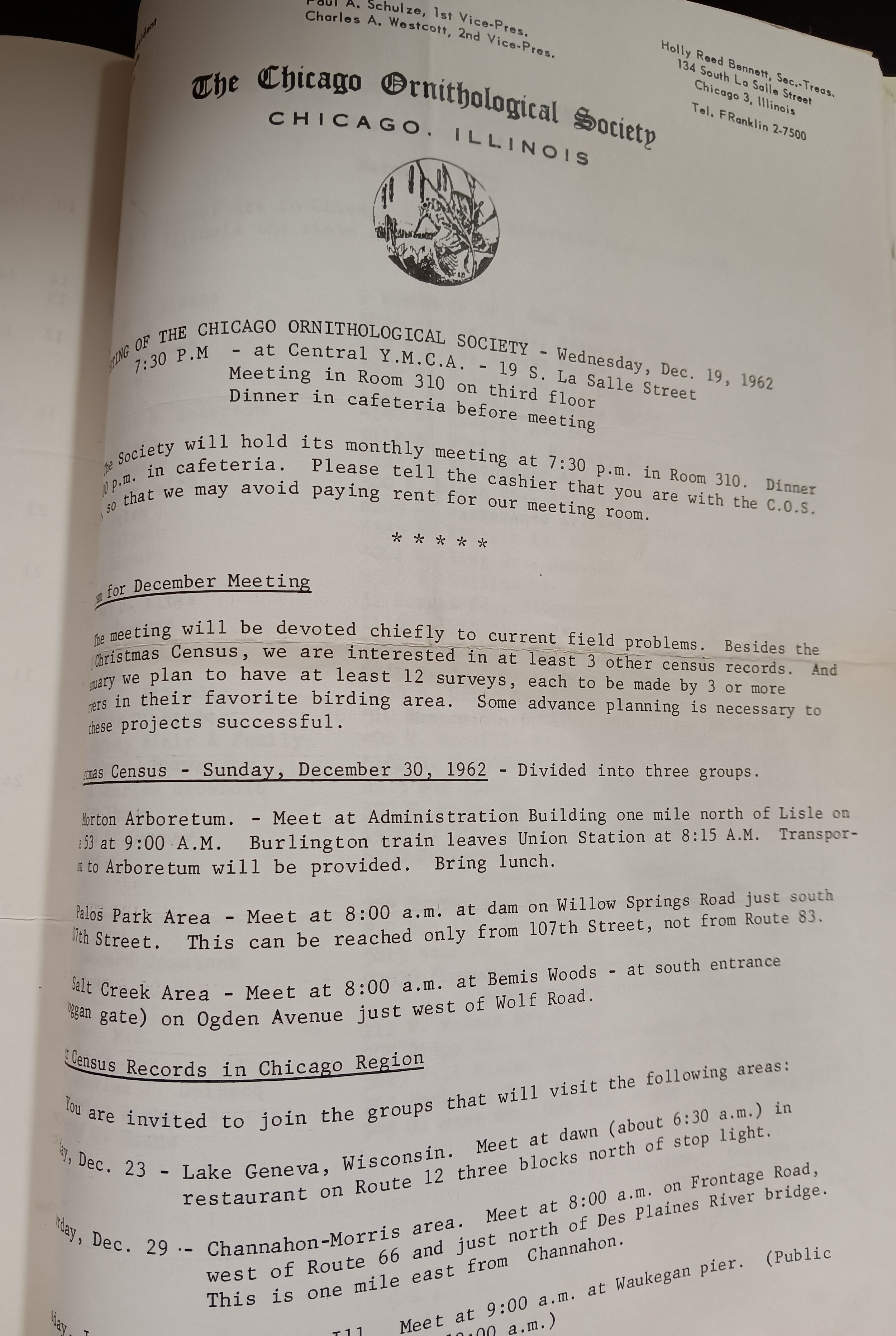
The COS letterhead featuring the original logo, from a meeting announcement in 1962.

“I love the composition of the original drawing,” says artist Kelly Ballantyne, who recently restored the logo for COS. “The woodcock surrounded by native shrubs, with what looks like a slough and a tree line in the background, made me wonder if the artist was inspired by an encounter in the Palos Preserves.”
There is no documentation we are aware of that explains why the woodcock was chosen as the mascot for COS. More than half a century later, we can only speculate. Over 100 birds breed in the Chicago area, and, frankly, when most people think of a Chicago bird, they don’t think of a timberdoodle. Could the unexpected nature of the choice be precisely the reason it was chosen? An utterly un-urban bird you can find in an urban (or, at least, suburban) area?
As COS secretary Katy Krigbaum points out, the woodcock is full of contradictions: “a shorebird that lives in the woods, a big rotund ball of feathers that does an incredible sky dance, a cryptic bird but a show-off.” The peculiarity of a woodcock is precisely why birders are so drawn to them.
“I love that they're so weird and unique and hard to find and so fascinating to people,” says COS membership committee chair Morgan Harpster. “To me that's the essence of birding: loving and being fascinated by some small part of nature, even when other people might not understand that.”
But many people do understand the charm of timberdoodles. This year, voters on COS social media crowned them the March Migration 2023 champ. Even outside of the birding world, woodcocks have made for great memes and gifs due to their bouncy strut.
In the world of local conservation, they are beloved because of the frequency with which they collide with city windows. “Knowing they are prone to window collisions makes me appreciate any opportunity to be around these birds even more,” says COS field trip committee chair Christina Harber. Lindsay Wilkes had never seen a woodcock until she found a collision victim in the West Loop while patrolling for the Chicago Bird Collision Monitors. The bird was walking down the sidewalk among hurried throngs of commuters, and she was baffled that people were walking past the odd little creature without giving it a second thought. She netted the bird, chuckled at its short legs and goofy eyes, and sent him on his journey to successful rehabilitation.
Whatever the reason the American Woodcock was selected to represent COS, its appropriateness has never been questioned, and the organization’s love for its mascot has endured. The original woodcock illustration appeared on COS letterheads until 1989, when it was replaced by a new woodcock illustration by then-President Walter Marcisz, which serves as the COS logo through the present day. Another illustration of a woodcock by Jenny Vogt was used in the new millennium for stickers sent to new COS members. As COS gets ready to reveal its newest American Woodcock logo, we are looking back at how this bird has carried us through our vision for more than a century, and placing our bets that its visage has the strength to carry us through a new era of community, conservation, and, of course, birding.
All this looking back has made us think: how did our little woodcock get here? Who was the artist? The archives do not provide any explicit information on its origins. Apparently, whoever designed it did not feel it was important to stand up in the middle of a meeting and pronounce: here he is, our beloved timberdoodle, and I am the one who brought him to life!
Modern branding, using specific colors, typeface, and imagery, arose during the industrial revolution as goods began to be mass produced. The years before the founding of COS saw a boom in the development of logos as we know them today, including for companies like Twinings Tea, Shell Oil, and Levi Strauss, as well as for nonprofits like the YMCA and the United Way. But with no website, coffee mugs, or tote bags to deal with, COS seemed little concerned with the art of selling itself and focused instead on the business of the day, including the potential legalization of waterfowl hunting in Chicago, indiscriminate use of DDT, a makeshift refuse dump at a rewilded clay pit in West Rogers Park, the “plight of ornithologists in war-devastated Europe,” and safe transportation for female members afraid to travel to nighttime COS meetings at the Chicago Natural History Museum (known today as the Field Museum).
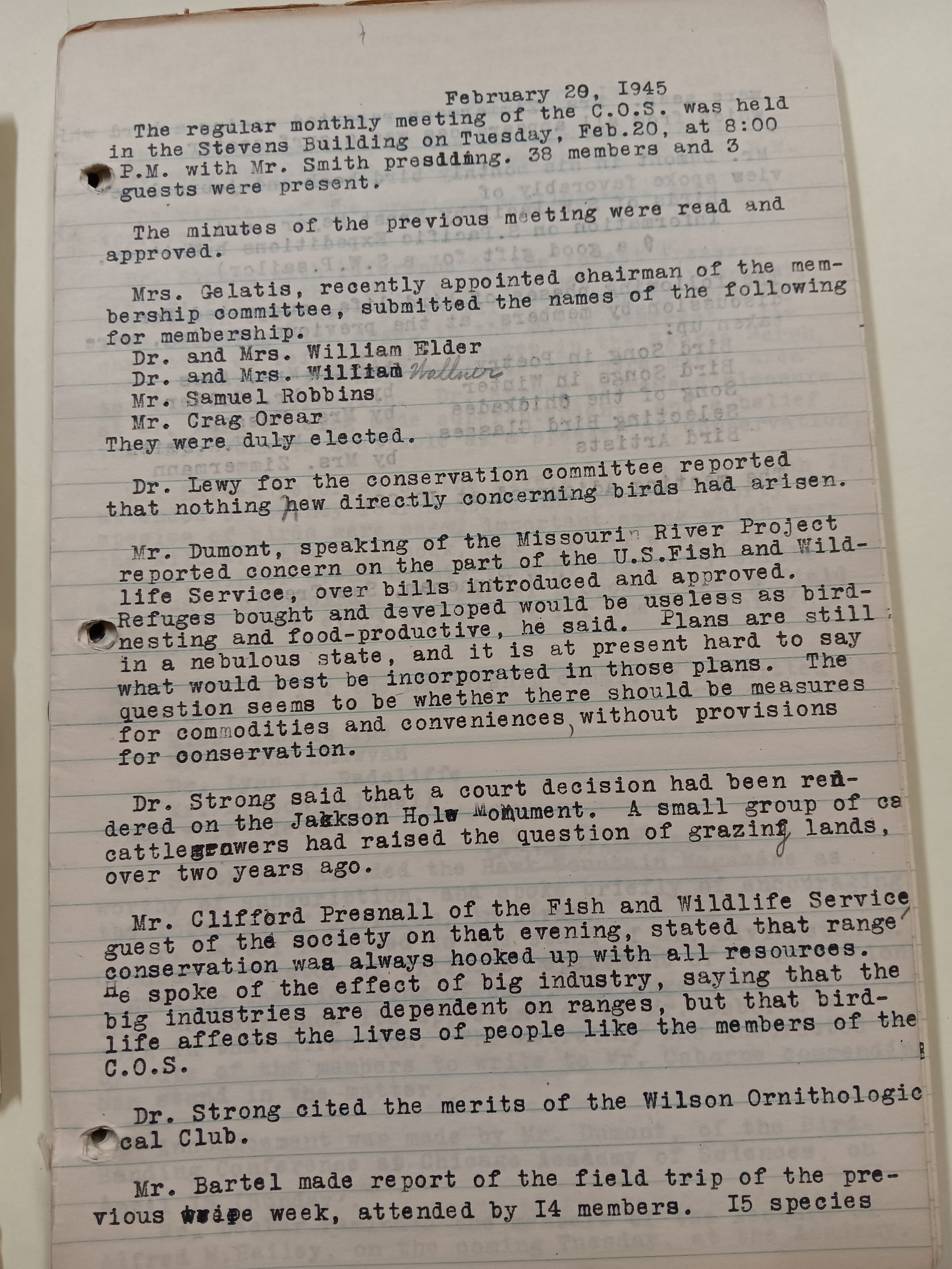
Minutes from the February 1945 COS meeting, in which the Jackson Hole Monument controversy is discussed.
Still, someone in the organization felt compelled by the twentieth century branding blitz to make sure COS had a recognizable emblem going forward. If only via an illustration on a simple letterhead, someone was savvy enough to understand that such an emblem can shape an organization’s identity and make its abstract ideas and actions something people can see and identify with. But who was that person? We believe the artist behind the original COS logo was none other than Dr. William J. Beecher.
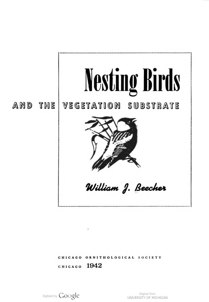
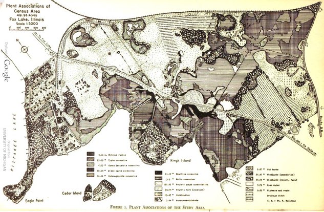
It’s nearly impossible to be a birder in the Chicago area without encountering an organization, a place, or a person that was directly influenced by Beecher. He was an essential force in conservation and science education throughout his lifetime, and he had a great affinity for birds. Beecher completed his degree at the University of Chicago in 1947. For his master’s work, he conducted an ecological survey of nesting birds in the Fox Lake Marshes. During his studies, he also worked at the Chicago Natural History Museum as an assistant zoologist.
Many of Chicago’s birding hotspots have been stewarded and shaped by Beecher. He served as director of the Little Red School House Nature Center from 1954 to 1957, and he was involved in many birding and conservation organizations throughout the years, including Chicago Audubon Society, Illinois Audubon Society, American Ornithological Union, The Adventurers Club, the Conservation Council, Illinois Nature Preserves Commission, The Nature Conservancy, Friends of Ryerson Woods, and the Open Lands Project. But, most importantly for our purposes, in June of 1947, Beecher was elected president of COS.
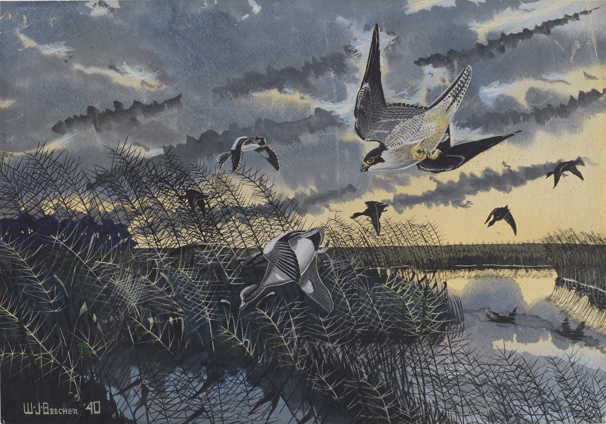
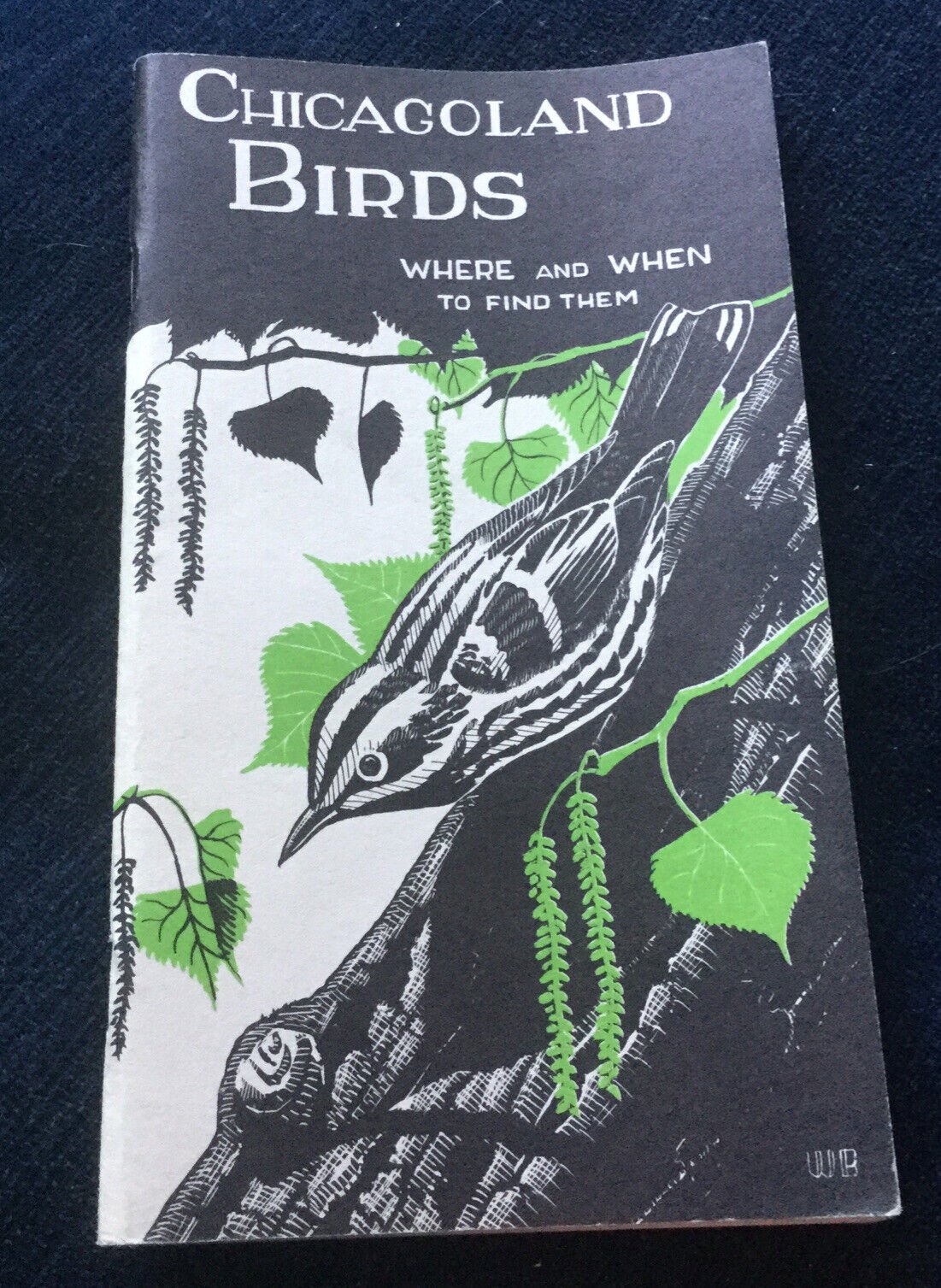
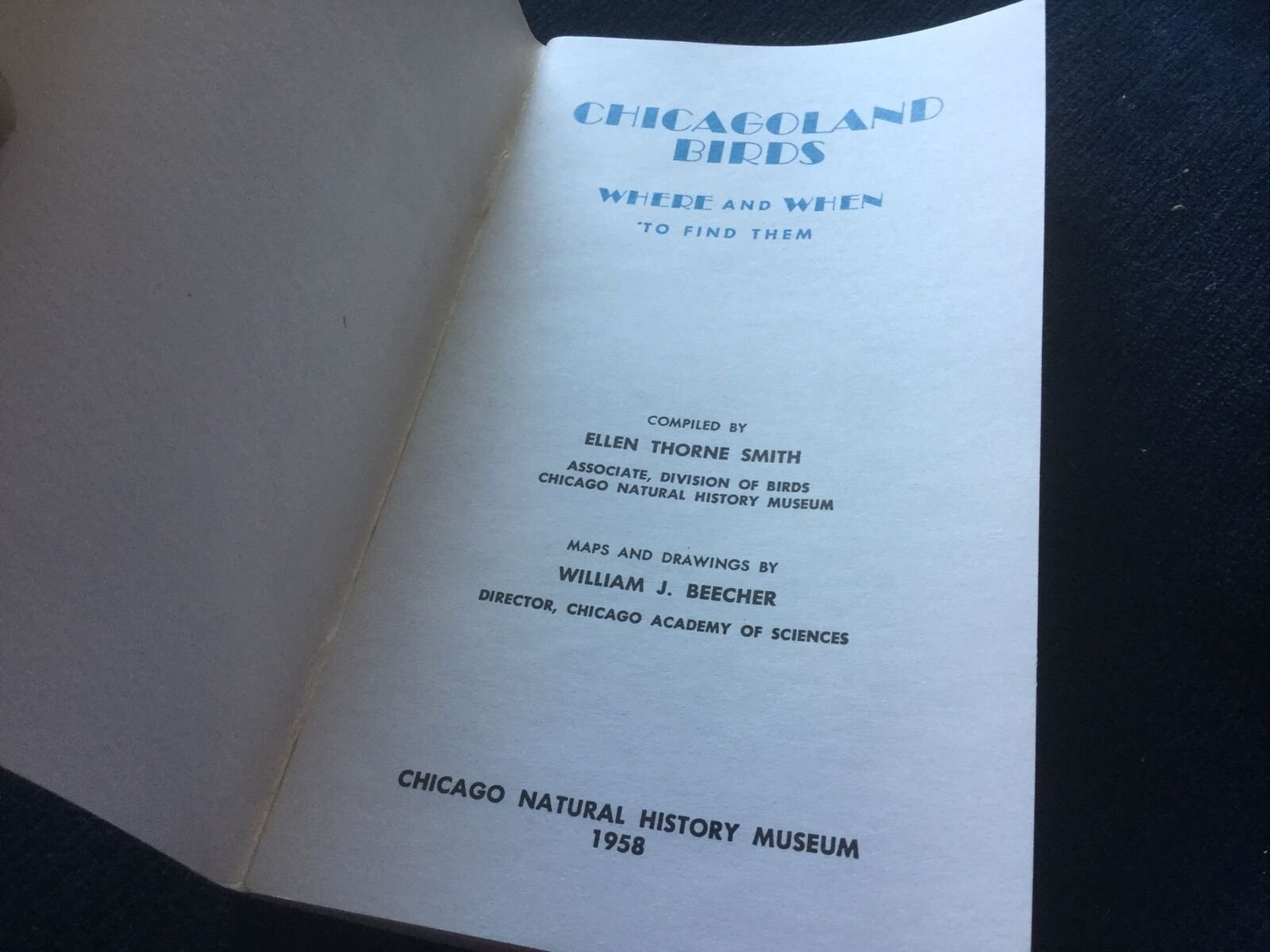
Of course, just because Beecher was perhaps the most famous president COS has had does not automatically make him the artist behind the bogsucker. What makes the hypothesis a real possibility is the knowledge that besides being a scientist and conservationist, Beecher was an artist and a budding graphic designer. In 1940 he painted Duck Hawk after Widgeon, which appears to be a work he submitted to (and which was purchased by) the Section of Fine Arts, a New Deal program that commissioned painters and sculptors to beautify public buildings. During his service in World War II, he sketched the birds he encountered on the Pacific Islands. We know that he also illustrated and designed the cover of Chicagoland Birds: Where and When to Find Them, a local field guide published by the Field Museum. And it is highly likely that he illustrated the cover and maps and designed the charts and diagrams for COS’s 1942 publication of his Fox Lake survey.
Further supporting the idea that Beecher was the man behind the logo is that the timing seems right. “I suspect,” says Ballantyne, “the artist created [the logo] using linocut, which is a type of printmaking technique that was introduced in the early 20th century. In this type of printmaking, the artist carves the design into linoleum (vs. other materials such as wood).” Beginning in the 1920s, linocut was coming into its own as a respected artform, and by the 1940s, when Beecher was involved with COS, it was in common use. Thus, suggesting that an artist, such as Beecher, in the 1940s would create a logo using linocut is not so far fetched.
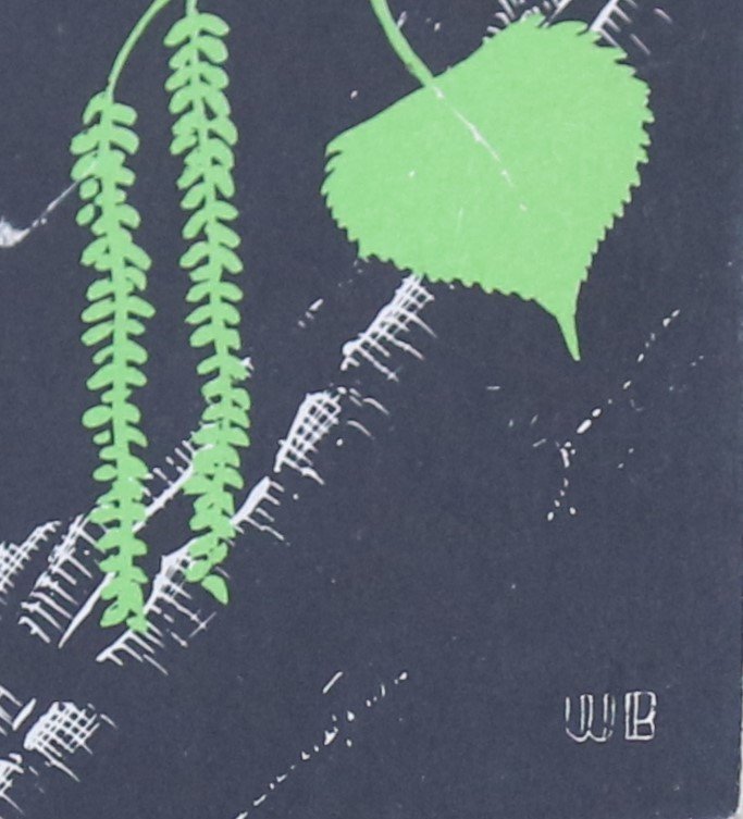
The final piece of evidence that Beecher was the likely artist of the original COS logo is a tangle of lines that appears to the right of the woodcock’s lower wing. “I believe that is William Beecher's distinctive monogram,” says Marcisz. “But the logo is highly degraded, so this is difficult to prove for certain.”

1981 COS letterhead. Beecher’s likely “WB” monogram is circled in red.
While it cannot be proven, it does seem probable. “I think you’re right,” said Ballantyne when we pointed out the similarities between the shape of these lines and Beecher’s monogram. “ I just assumed it was part of the background. But in the file I was working off of, that shape looks similar to his monogram.”

Recreated COS logo by Kelly Ballantyne, with William Beecher’s WB monogram restored.
Thus, while we can’t know with 100 percent certainty, we feel pretty confident in pronouncing Dr. William J. Beecher the brains behind turning the American Woodcock, perhaps the most peculiar bird in North America, into the symbol of COS and all that it stands for, namely: “promoting the appreciation and conservation of birds throughout the Chicago region.” It seems absolutely fitting in this respect; after all, if you can’t appreciate a timberdoodle, what can you appreciate?